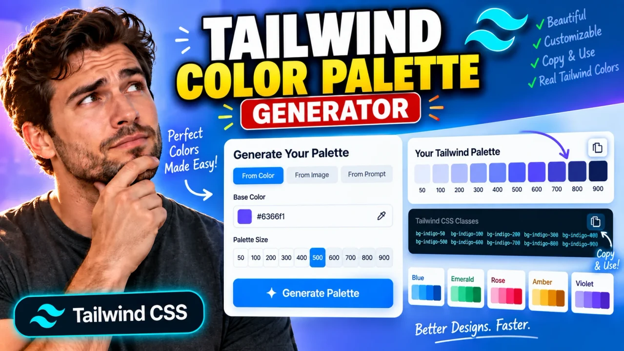
About Tailwind Color Palette Generator
Tailwind Color Palette Generator is a browser-based color generator for creating a structured, Tailwind-style color scale from a single base color. Instead of manually adjusting the same brand color again and again for backgrounds, borders, buttons, text, hover states, and dark interfaces, you can start with one seed color and generate a coordinated range of lighter and darker shades.
The tool is intended for front-end developers, UI/UX designers, product teams, design-system authors, freelancers, and anyone building interfaces with Tailwind CSS or a Tailwind-inspired design-token system. It is especially useful when a brand or project has one known primary color but needs a complete tonal scale that can be used consistently throughout a website, dashboard, SaaS application, landing page, component library, or design system.
What the Tailwind Color Palette Generator Tool Does
The core input is a base or seed color, normally supplied as a hexadecimal web color such as #3B82F6. From that seed, the generator creates a light-to-dark palette using the familiar Tailwind-style shade labels 50, 100, 200, 300, 400, 500, 600, 700, 800, 900, and 950.
The result is a practical set of color tokens rather than a single color. The lightest shades can be used for subtle surfaces, cards, badges, backgrounds, and soft accents, while the middle shades are useful for primary UI elements and the darkest shades can support stronger text, borders, active states, dark surfaces, or emphasis. The exact role of each shade depends on the design and accessibility requirements of the project.
| Item | Typical value or behavior |
|---|---|
| Tool type | Color palette generator |
| Required input | One base/seed color |
| Primary input format | HEX, such as #3B82F6 |
| Primary output | Tailwind-style shades from 50 through 950 |
| Useful output formats | Web color values and copy-ready Tailwind/CSS token mappings |
| Units | None; colors are digital color values, not physical measurements |
| Best use | UI design, branding, Tailwind CSS themes, and design systems |
Why a Palette Scale Is Useful
A single brand color rarely works equally well for every component. Using the same exact hexadecimal value for a button, page background, border, hover state, disabled state, and large dark panel can make an interface look flat or create poor contrast. A shade scale gives the design more range while keeping the visual identity connected.
For example, a generated brand-50 or brand-100 shade can work as a very light background behind a notice or card. A brand-200 or brand-300 value can be useful for subtle borders and fills. A mid-range value such as brand-500 can serve as a primary brand tone, while brand-600 and brand-700 can support stronger controls, links, hover states, or selected states. The very dark end, such as brand-800 through brand-950, can provide stronger emphasis or dark-theme surfaces.
How to Use
- Choose the brand, accent, or interface color you want to use as the palette's starting point.
- Enter the color as a valid HEX value, using a six-digit value such as
#3B82F6. - Generate the palette so the tool can produce the light-to-dark shade range.
- Review the complete scale from
50to950and identify the tones that best fit your interface roles. - Copy the generated values or Tailwind-style token names into your project, theme, CSS variables, or design documentation.
- Test important foreground/background combinations for contrast before using the palette in production.
Technical Explanation and Generation Logic
This is a generator, not a calculator with one universal mathematical equation. Tailwind-style palettes are ordered color systems in which the numeric labels describe positions in a tonal scale; they are not simply a fixed percentage of white or black applied to a HEX value.
A technically sound palette-generation workflow can be described as follows:
- Parse the seed color: Convert the supplied HEX value into its underlying RGB components.
- Move to a perceptual color representation: A perceptual space such as OKLCH can be used to make changes in perceived lightness more predictable than naïve RGB interpolation.
- Create tonal targets: Establish progressively lighter and darker positions for the 11 shade labels, with
50representing the light end and950representing the dark end. - Control hue and chroma: Keep the palette visually related to the seed while adjusting chroma when necessary so that extreme light or dark steps remain usable.
- Handle display gamut: Colors outside the supported RGB display gamut may require gamut mapping or chroma reduction before conversion back to a web-safe representation.
- Convert and round output values: The resulting colors can be converted back into HEX or another supported web color format and rounded for practical use.
There is an important distinction between a Tailwind-style generated palette and the official Tailwind default palette. The official Tailwind color collections are curated color systems rather than a single publicly defined formula that can be applied to any arbitrary seed color. Therefore, a generated custom palette should be treated as a practical approximation following the same naming and tonal conventions, not as an exact recreation of Tailwind's professionally curated default colors.
Preset Examples and Quick Reference
| Seed example | Palette range | Typical design roles |
|---|---|---|
#3B82F6 |
50–950 | Blue brand surfaces, buttons, links, focus states, dark accents |
#16A34A |
50–950 | Success messaging, status indicators, confirmations, brand accents |
#9333EA |
50–950 | Creative accents, highlights, premium UI treatments, gradients |
A typical generated token structure can look like this:
brand-50
brand-100
brand-200
brand-300
brand-400
brand-500
brand-600
brand-700
brand-800
brand-900
brand-950
For a Tailwind project, those roles can then be mapped into a custom theme namespace or CSS variables. A practical naming pattern is --color-brand-50, --color-brand-500, and --color-brand-950, with the corresponding generated values inserted by the developer.
Assumptions
The generator assumes that the supplied seed is a valid web color and that the user wants a visually coherent monochromatic or near-monochromatic scale rather than a multi-hue color scheme. The numbered shades are treated as ordered tonal positions, not as guaranteed WCAG contrast levels or fixed luminance percentages.
Limitations
Generated palettes are starting points, not a substitute for design review. Extremely saturated colors, fluorescent colors, or colors close to the limits of the displayable gamut may require noticeable chroma adjustment at the lightest or darkest ends. Two palette-generation algorithms can therefore produce different values from the same seed while both remaining visually reasonable.
The generator also does not automatically guarantee that every text/background combination is accessible. A shade that looks appropriate in isolation may fail a contrast requirement when used with small text, icons, form controls, or interactive states. Always validate the actual combinations used in your interface.
Likewise, a generated palette does not automatically become part of Tailwind CSS merely because the values use Tailwind-style names. You still need to register the custom tokens in your project's theme or CSS and ensure that your class names match the values you intend to ship.