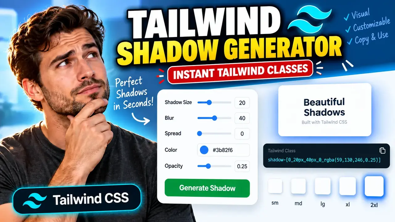
Tailwind Shadow Generator – Create CSS Shadows
TL;DR Summary
Tailwind Shadow Generator helps you create and preview CSS box shadows in a Tailwind CSS-friendly format, so you can adjust shadow values without writing the full shadow declaration by hand. The available privacy behavior is not specified by the supplied tool context, so avoid entering sensitive information unless the page clearly explains how entered values are handled.
About This Tool
Tailwind Shadow Generator is a browser-based design utility for creating box shadows that can be used in Tailwind CSS projects. Shadows are a common part of modern web design. They can make cards, buttons, panels, menus, inputs, and other interface elements look raised, separated, or layered.
Writing a shadow manually can be inconvenient when you need to test several combinations of horizontal offset, vertical offset, blur, spread, color, and opacity. A shadow generator provides a visual way to explore those values and turn the selected settings into CSS or Tailwind-friendly output.
This tool is useful for web developers, UI designers, frontend engineers, students, and anyone building a website with Tailwind CSS. It can also help when you want to experiment with a subtle shadow for a card or a stronger shadow for a modal, dropdown, or floating element.
The main purpose of the Tailwind Shadow Generator is not to perform a mathematical conversion such as a unit converter. It is a visual code-generation tool. You choose shadow settings, review the resulting appearance, and use the generated shadow value in your project.
What You Can Create
A CSS box shadow is normally described with values for horizontal offset, vertical offset, blur radius, spread radius, and color. An optional inset keyword can change the shadow from an outside shadow to an inside shadow.
A typical CSS shadow follows this structure:
box-shadow: offset-x offset-y blur-radius spread-radius color;For example:
box-shadow: 0 4px 12px 0 rgba(0, 0, 0, 0.15);The exact controls and output format available on the live Tailwind Shadow Generator page should be treated as the source of truth. The supplied context identifies the tool by name but does not document its exact interface, default values, supported color formats, preset list, or copy/export behavior.
How Shadow Values Work
| Value | Purpose |
|---|---|
| Offset X | Moves the shadow left or right. |
| Offset Y | Moves the shadow up or down. |
| Blur radius | Controls how soft or sharp the shadow edge appears. |
| Spread radius | Controls how much the shadow expands or contracts before the blur is applied. |
| Color | Controls the shadow color. |
| Opacity | Controls how transparent the shadow color is when the selected interface exposes opacity separately. |
| Inset | Changes the shadow from an outside shadow to an inside shadow when supported. |
Pixel values such as px are commonly used for shadow offsets, blur, and spread. The generated result may use Tailwind CSS syntax or an arbitrary value depending on the implementation of the tool. Do not assume that every shadow can be represented by one of Tailwind's predefined shadow utility classes. Custom shadow values may require an arbitrary Tailwind value or custom theme configuration.
How to Use
- Step 1: Open the Tailwind Shadow Generator and review the available shadow controls.
- Step 2: Adjust the horizontal and vertical shadow offsets to control the direction and position of the shadow.
- Step 3: Adjust the blur value to make the shadow softer or more defined.
- Step 4: Adjust the spread value if the generator provides a spread control and you need to change the shadow's overall size.
- Step 5: Select or adjust the shadow color and transparency options provided by the tool.
- Step 6: Use the preview, if provided, to check how the shadow looks against the displayed element or background.
- Step 7: Copy the generated CSS or Tailwind-compatible value and place it in the appropriate part of your Tailwind CSS project.
- Step 8: Test the generated shadow in your actual interface because the surrounding background, element size, border, and lighting style can change how a shadow appears.
Technical Explanation / Formula
For a standard single CSS box shadow, the underlying syntax is:
box-shadow: offset-x offset-y blur-radius spread-radius color;Each part has a specific role:
- offset-x: The horizontal displacement of the shadow. A positive value generally moves the shadow to the right, while a negative value moves it to the left.
- offset-y: The vertical displacement. A positive value generally moves the shadow downward, while a negative value moves it upward.
- blur-radius: The amount of blur applied around the shadow. Larger values normally produce a softer shadow.
- spread-radius: Changes the size of the shadow before the blur is applied. It can be positive or negative.
- color: Defines the shadow's color and may include transparency, depending on the color format used.
There is no single mathematical formula that determines a visually correct shadow. A generator instead combines the values selected by the user into a valid shadow declaration or Tailwind-compatible representation. The visual result is then rendered by the browser's CSS engine.
For example, if the selected values are 0px horizontal offset, 4px vertical offset, 12px blur, 0px spread, and black at 15% opacity, the corresponding CSS can be represented as:
box-shadow: 0 4px 12px 0 rgba(0, 0, 0, 0.15);This means the shadow has no horizontal displacement, extends 4 pixels downward, uses a 12-pixel blur radius, has no additional spread, and uses a partially transparent black color.
Preset Examples / Quick Reference
| Design Goal | Example CSS Shadow | Typical Use |
|---|---|---|
| Subtle lift | 0 1px 3px rgba(0, 0, 0, 0.10) |
Small cards, inputs, and quiet UI elements |
| Medium elevation | 0 4px 12px rgba(0, 0, 0, 0.15) |
Cards, panels, and floating controls |
| Strong elevation | 0 8px 24px rgba(0, 0, 0, 0.18) |
Menus, dialogs, and prominent floating elements |
These are example shadow values for understanding the controls, not claims about presets included in the Toolhox tool.
Why Use This Tailwind Shadow Generator & How Our Tailwind Shadow Generator Beats the Competition
The practical value of a shadow generator depends on how it fits into a developer's workflow. Different approaches work for different situations. The comparison below describes general workflow differences rather than claiming superiority over specific competing products.
| Method | Ease of Use | Calculation Speed | Best For | Limitations |
|---|---|---|---|---|
| Toolhox Tailwind Shadow Generator | Uses a dedicated shadow-generation interface | Designed for interactive shadow creation | Developers and designers creating Tailwind-friendly shadows | Exact controls and output options depend on the live tool implementation |
| Manual CSS Calculation | Requires knowledge of box-shadow syntax | Immediate once the desired values are known | Developers who already know the required shadow | Requires manual testing and editing |
| Spreadsheet Calculation | Requires setting up formulas and cells | Depends on the spreadsheet setup | Projects that need repeatable value tracking | Not naturally designed for visual shadow editing |
| Professional Design Software | Can involve more controls and workflow steps | Depends on the application and workflow | Broader visual design work | May include many features unrelated to generating Tailwind shadow code |
A dedicated Tailwind Shadow Generator is most useful when the task is specifically about creating and testing CSS shadows for a Tailwind-based interface. Manual CSS remains practical when you already know the values. Larger design applications may make more sense when shadow creation is only one part of a wider visual design workflow.
Assumptions and Limitations
The tool name indicates a focus on Tailwind CSS shadow generation, but the supplied context does not expose the complete implementation or interface. Therefore, users should rely on the controls and output shown on the live page for the exact supported options.
A generated shadow is a styling value, not a guarantee that the design will look correct in every situation. The final appearance depends on the background color, element shape, borders, nearby elements, lighting style, screen rendering, and other CSS properties.
Users should also distinguish between Tailwind's predefined shadow utilities and custom shadow values. If the generated shadow does not correspond to an existing utility in the project's Tailwind configuration, an arbitrary value or custom theme configuration may be needed.
When using the result in production, test it at the actual component size and against the real page background. Very dark or large shadows can reduce visual clarity, while very subtle shadows may have little visible effect.
The supplied tool information does not document a specific privacy policy or data-processing model. Do not assume that entered values are processed only in the browser, never uploaded, or never stored. Avoid entering sensitive information unless the page clearly states how data is handled.
For normal interface styling, the generated value can be treated as a design aid. It should not be treated as a measurement of physical light, material properties, or any professional engineering result.